Navigating the fastest route to public transport data in netBI
Format: Desktop web application, business intelligence tool
Team: Product designer (solo), engineers, CEO
Role: Product design, research, product strategy
Status: Delivered

Introducing netBI
netBI is a business intelligence platform serving government authorities, public and private bus operators and consulting companies across the mass transit, road and traffic sector in Australia, New Zealand and the UK. netBI is known for its seamless delivery of accurate and trustworthy data that empowers customers to make confident, data-driven decisions.
Public transport as a data driven business
netBI was originally built as a technical reporting tool, designed primarily for specialists and transport authorities. But as access to data has grown, so has the need for a wider range of users to engage with that data. Everyone now realises that public transport has become a deeply data-driven industry and the platform’s user base has expanded far beyond its original scope.
As a result, many non-technical users began to feel overwhelmed by the complexity. The experience no longer matched most user needs and people got lost and didn’t make good use of netBI’s full potential. It became clear that the platform needed to evolve: from a tool built for experts to one that supports how everyone actually works.
We saw an opportunity to shift the platform from being data-heavy to intent-driven: built around how people actually work. The result: faster task completion and a product that better supports day-to-day operations.
Understanding the customers
netBI supports a broad spectrum of different users (bus operators, planners, dispatchers, C-suite executives, bus drivers, consultants, regulators and many more). They all have different responsibilities and therefore are using the tool in a different way.
What users rely on netBI for at a high level:

Looking at an example
Mark Davies is an Operations Manager working for a private bus operator in Australia. His job is to make sure buses are on time every day. Each evening, Mark reviews today’s performance data to answer a simple but critical question:
“What can we do better tomorrow?”
He relies on multiple key reports to answer this question. While the data exists in netBI, the current navigation and steps required to access these reports are so complex and unintuitive that Mark’s company is now considering rebuilding what he needs in Power BI.
This is Mark’s current process to access just 3 of those reports:
Researching the problem
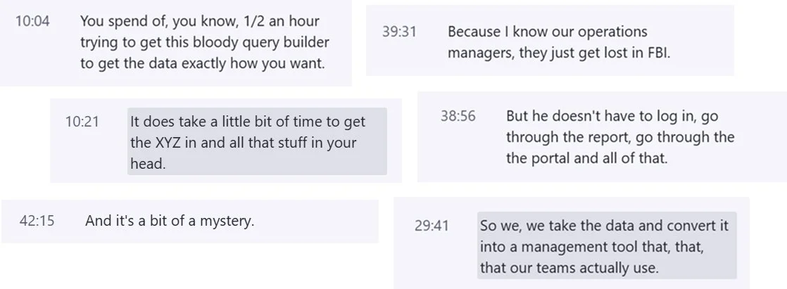
Mark’s experience revealed a broader issue: even experienced users were working around netBI, not with it. The platform technically had all the right data but not in a format or flow that aligned with users real-world goals, mental models or time constraints.
Through interviews and feedback sessions, we realised Mark wasn’t alone. Many customers faced similar frustrations. They knew what they wanted but struggled with navigating the complexity, unclear structure and hidden functionality.
Defining the problem
Poor information architecture and navigation: Users get lost in the tool. They can't find what they need, don’t know where they are in the system and struggle to navigate back.
Hidden functionality due to overcomplexity: The product’s capabilities are buried behind a cluttered UI, technical jargon and poor layout.
Lack of role-specific, streamlined interfaces: Users currently get general-purpose access. Everyone can see everything. What they need is quick, focused access to what they care about.
Prototyping and testing
To move from problem space to potential solutions, we focused on the top 3 most common jobs-to-be-done in netBI. One of them were operations managers reviewing daily bus services.
We began mapping out key assumptions (how might we ... ?) around how operations managers navigate netBI. From there, we prioritised the riskiest assumptions first and started testing them with wireframes:
How might we create a world where:
Mark can navigate netBI in a way that fits his mental model and not the data
Mark can access his reports within less than 3 clicks
Mark only sees what’s important to him
Forming a hypothesis
With the core problems defined and our "How might we" questions defined, we moved on to prototyping. The goal: explore new ways of navigating, organising and surfacing key information.
We started with low-fidelity wireframes to quickly explore layout and structure, then moved into interactive prototypes using Figma make and Bolt. Figma Make can be connected to Microsoft Clarity, which was incredibly useful for unmoderated testing sessions. Each round of testing helped us surface usability issues, validate assumptions and refine the information architecture around real user needs.
To stay focused on solving the core problems, we centred our testing with ops managers around a few key questions:
Can they easily find what they need?
Does the structure align with how they think?
How quickly can they find what they need?
Does the interface feel clearer, faster and more relevant to their daily workflow?
Designing a useful solution
Topics and subtopics
We introduced a new topic and subtopic structure that allows producers to organise content into logical groupings tailored to specific teams or projects. It’s like a folder system but one that supports granular permissions and better mirrors how people think about their work.
Mark now finds the reports he needs grouped under a topic called “Operations reports”.
Toolkit button
To tackle the second problem - hidden functionality - we added a “Toolbox” button that will always be there, designed as an entry point to commonly used actions and tools in one place.
Mark uses the Toolbox to quickly drill through more data and to see, what’s even possible.
Personalised home screen
To support different roles, producers can now personalise what each user sees. Executives get high-level summaries, while analysts access detailed topics. This shift from a “one-size-fits-all” interface to a role-sensitive experience means users spend less time searching.
Mark can now structure his personal topics and subtopics and his homescreen in a way that suits his workflow. His manager can also easily give him access to the relevant topics in one place.
Sharing some final, personal thoughts
This project was kicked off right after the product had been acquired by another company. This brought some ambiguity about the product's direction. While a product vision for the future was mostly in place, ownership and management around how to actually approach getting there were missing. There were no clear responsibilities or a dedicated product manager or owner driving the process, which meant that much of the coordination and structure had to come from within the team.
Working on this product also required a fair bit of industry knowledge and BI skills to effectively make decisions or speak professionally with users. My biggest takeaway from this project has definitely been around strategy: learning how to communicate with different people, from engineers to users to management and how to steer conversations and decisions in a direction that benefits both the customer and the business.